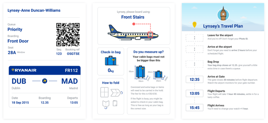
In the following article we’ll outline the beginnings of the project, some of the challenges we encountered and ultimately what we learned from the process of redesigning Ryanair’s boarding pass.
Difference between this redesign and many of the Dribble shots that can be found online is that this one was actually tested early on, and is satisfying both client and business requirements. You’ll – for example – see that the barcode on the final design was altered from the proposed QR Code (as shown above) to a 2D barcode because that’s just how airports want them to be.