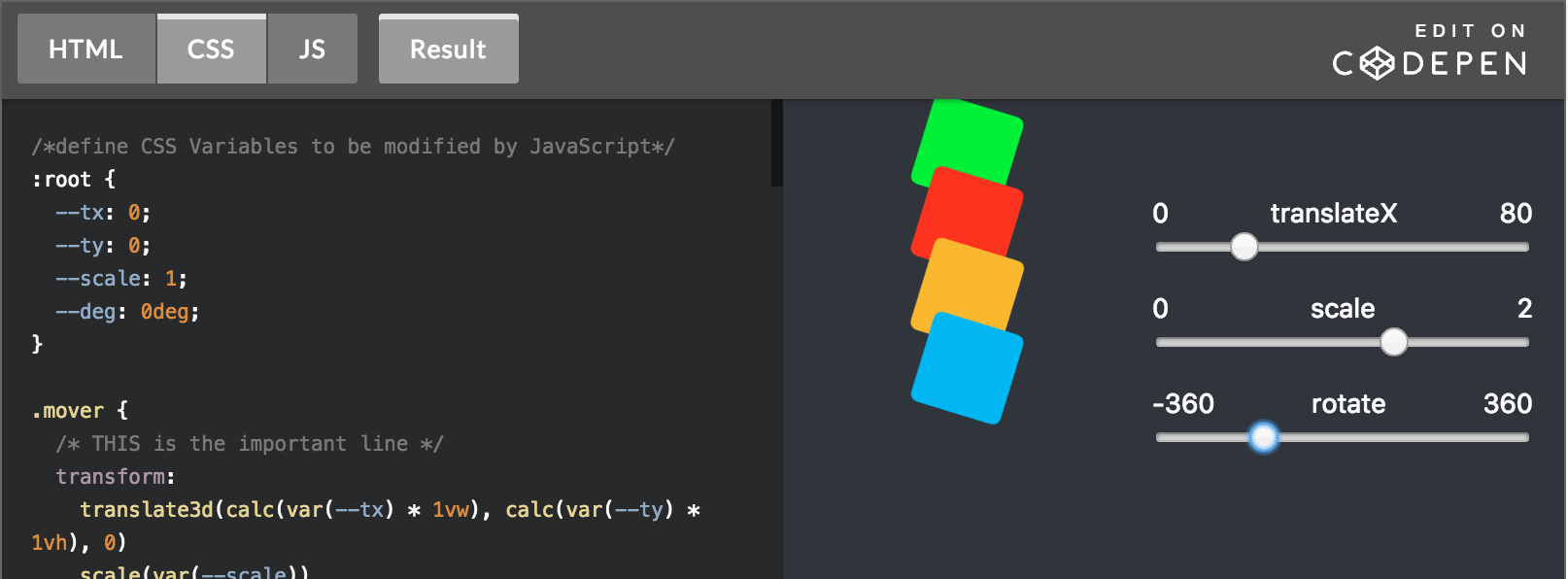
In CSS we use the transform property to manage an element’s translation, rotation, and scale. As it’s one single combined property for all three possible transformations, setting transform: rotation(90deg); on an element will (re)set the values for translation and scale by falling back to their default values.
This will change when the “CSS Transform Module Level 2” spec will be approved and implemented (currently already partly in Chrome Canary), as it introduces separate properties for each possible transformation:
The
translate,rotate, andscaleproperties allow authors to specify simple transforms independently, in a way that maps to typical user interface usage, rather than having to remember the order in transform that keeps the actions oftranslate(),rotate()andscale()independent and acting in screen coordinates.
Dan Wilson created a nice demo to already use this kind of behavior today, with the help of CSS Variables. Initially the CSS transform is set to the default values using this snippet:
:root {
  --tx: 0;
  --ty: 0;
  --scale: 1;
  --deg: 0deg;
}

el {
  transform:
    translate3d(calc(var(--tx) * 1vw), calc(var(--ty) * 1vh), 0)
    scale(var(--scale))
    rotate(var(--deg));
}
As the transformation property values are linked to the CSS variables you can now change them individually – be it in CSS or via JS – just like the “CSS Transform Module Level 2” allows one to do.
Not entirely familiar with CSS Variables? CSS Variables: var(–subtitle); is a good video/presentation to get you started.
Here’s a demo that uses JS to change the individual values:
