Adam Silver, who works at/with the fine folks at GOV.UK:
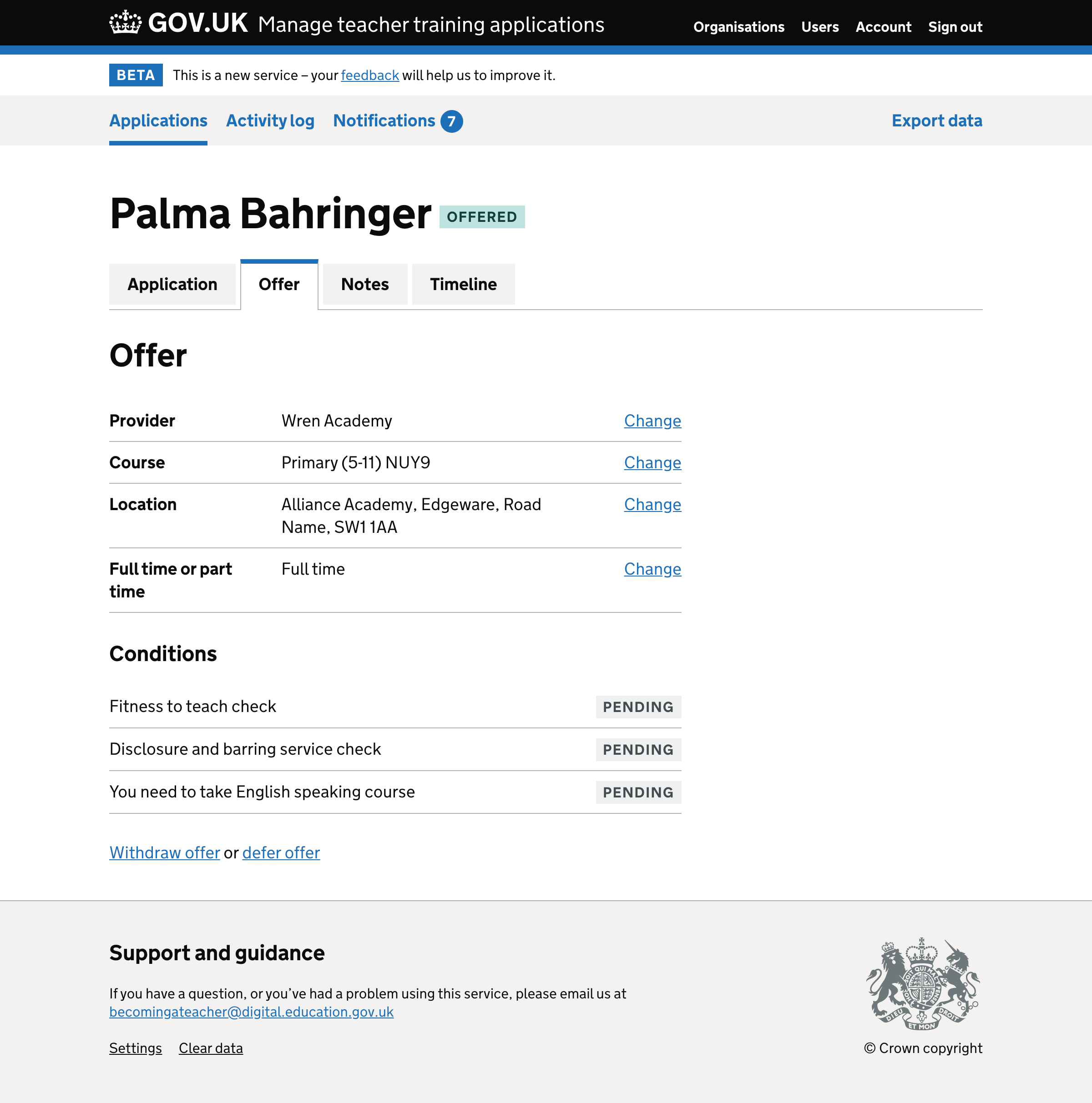
Tabs should only look like tabs if they behave like tabs otherwise it can be in disorienting and confusing for users.
Shown above is the old layout that featured the tabs (which are actually links, here). The new version still has the links in place at the same position, but they’ve styled them differently so that the look less like tabs.