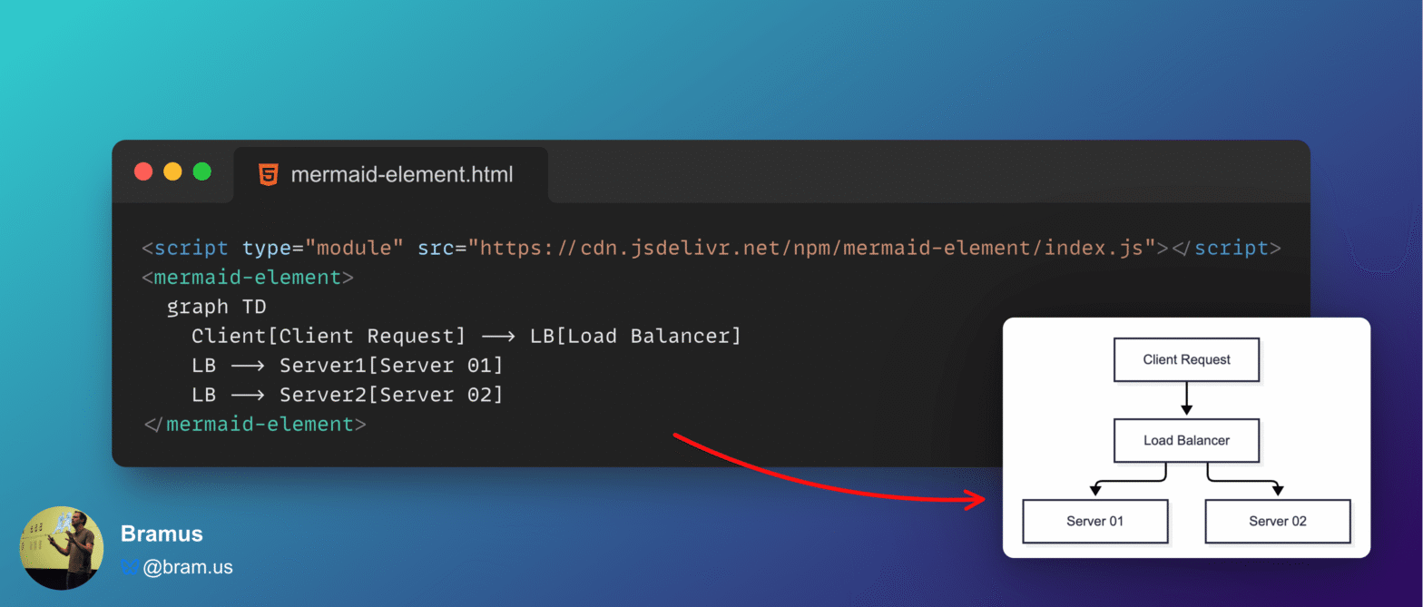
Today I learned that CodePen supports Mermaid diagrams — Chris Coyier has a a whole collection with examples here — and I also learned that there is no custom element to easily include these in your markup … so I built one.
A rather geeky/technical weblog, est. 2001, by Bramus
<mermaid-element>, a custom element to display Mermaid diagrams Today I learned that CodePen supports Mermaid diagrams — Chris Coyier has a a whole collection with examples here — and I also learned that there is no custom element to easily include these in your markup … so I built one.
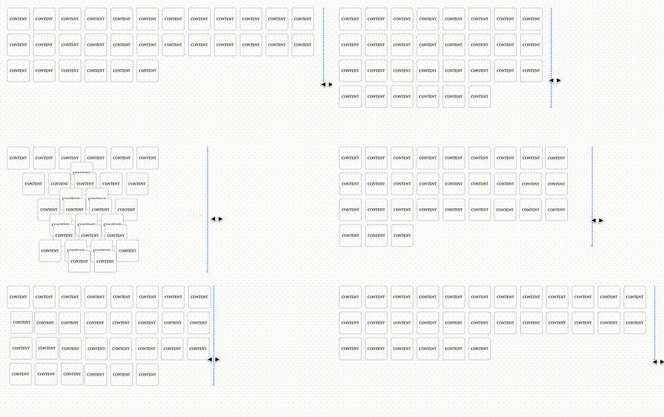
At CSS Day (back in June), someone asked me how Brave (the browser) might have built their New Tab Page which features some tiles laid out in a grid. While the grid is nothing spectacular, something special happens with it when you resize the viewport: as the available space changes, the grid nicely reorganizes itself in an animated way. The animations are also interruptible, so no View Transitions seem to be at play.
So, how did they do it? I’m not sure. But if I were to recreate it, I’d use CSS Anchor Positioning with regular CSS Transitions on top.
<hic-pageflip>: A Pageflip/Flipbook Custom Element powered by HTML-in-Canvas
Way back in 2005, I used a Flash PageFlip component to display a book on a website. Ever since, recreating a modern version has been on my backlog to investigate. With the arrival of the experimental HTML-in-Canvas API, we can finally bring it back — this time displaying real HTML.
@supports named-feature()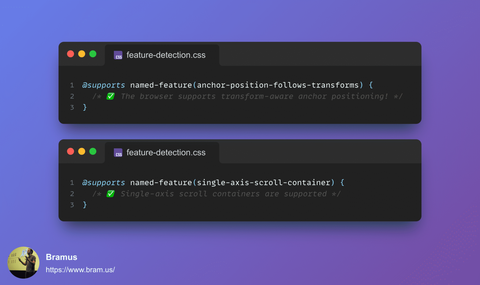
In CSS you can feature detect support for things like selectors, properties + values, and at-rules using @supports. But how do you feature detect a change to an underlying implementation, or two existing properties suddenly working together? Enter @supports named-feature(), a function designed to expose these specific capabilities without relying on hacky workarounds.
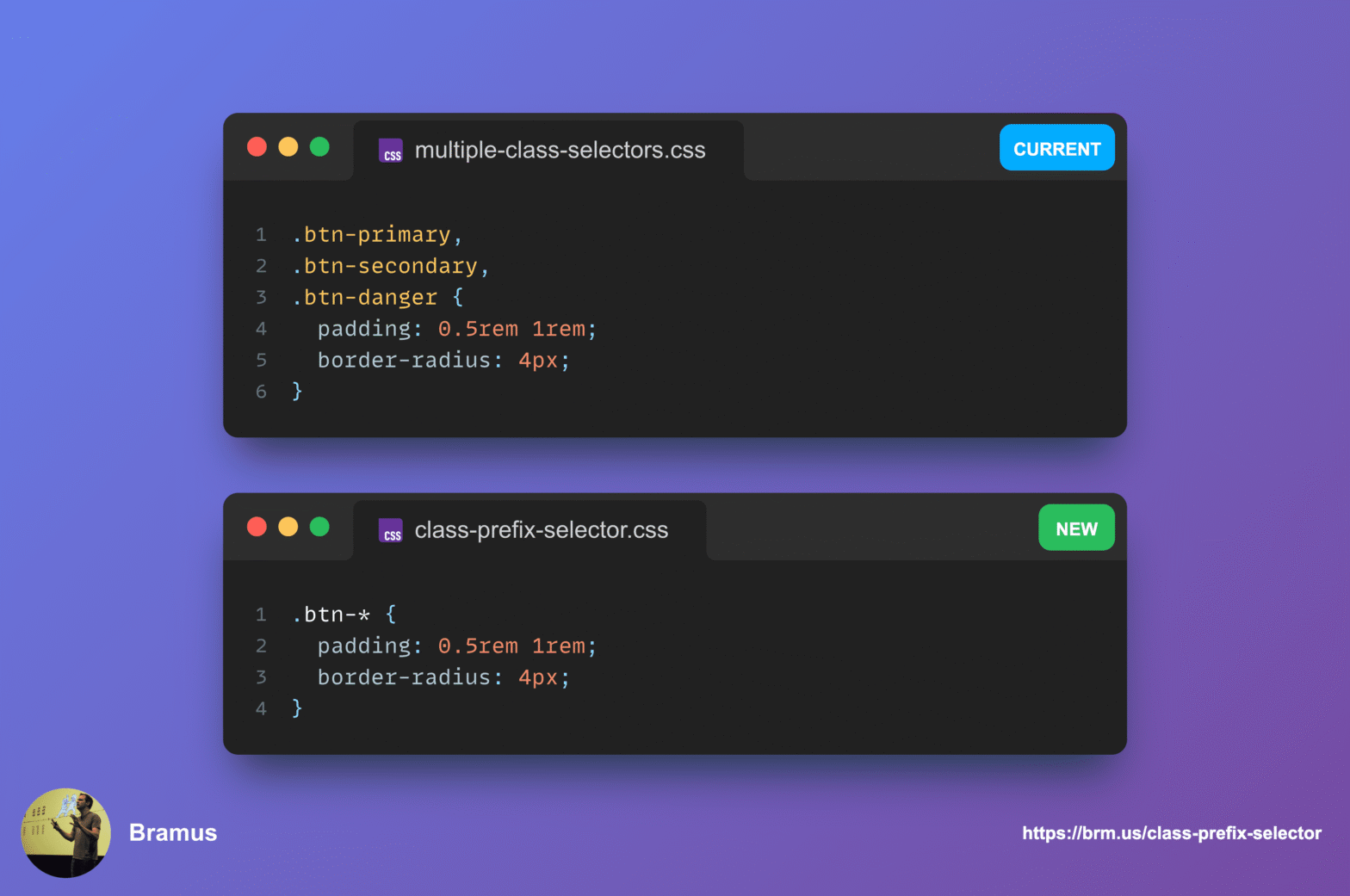
To target multiple classes that share the same prefix, you’d typically have to resort to adding an extra base classes to your markup or to using badly performing attribute selectors. To make things easier, CSS is getting a new selector: The Class Prefix Selector (.prefix-*).
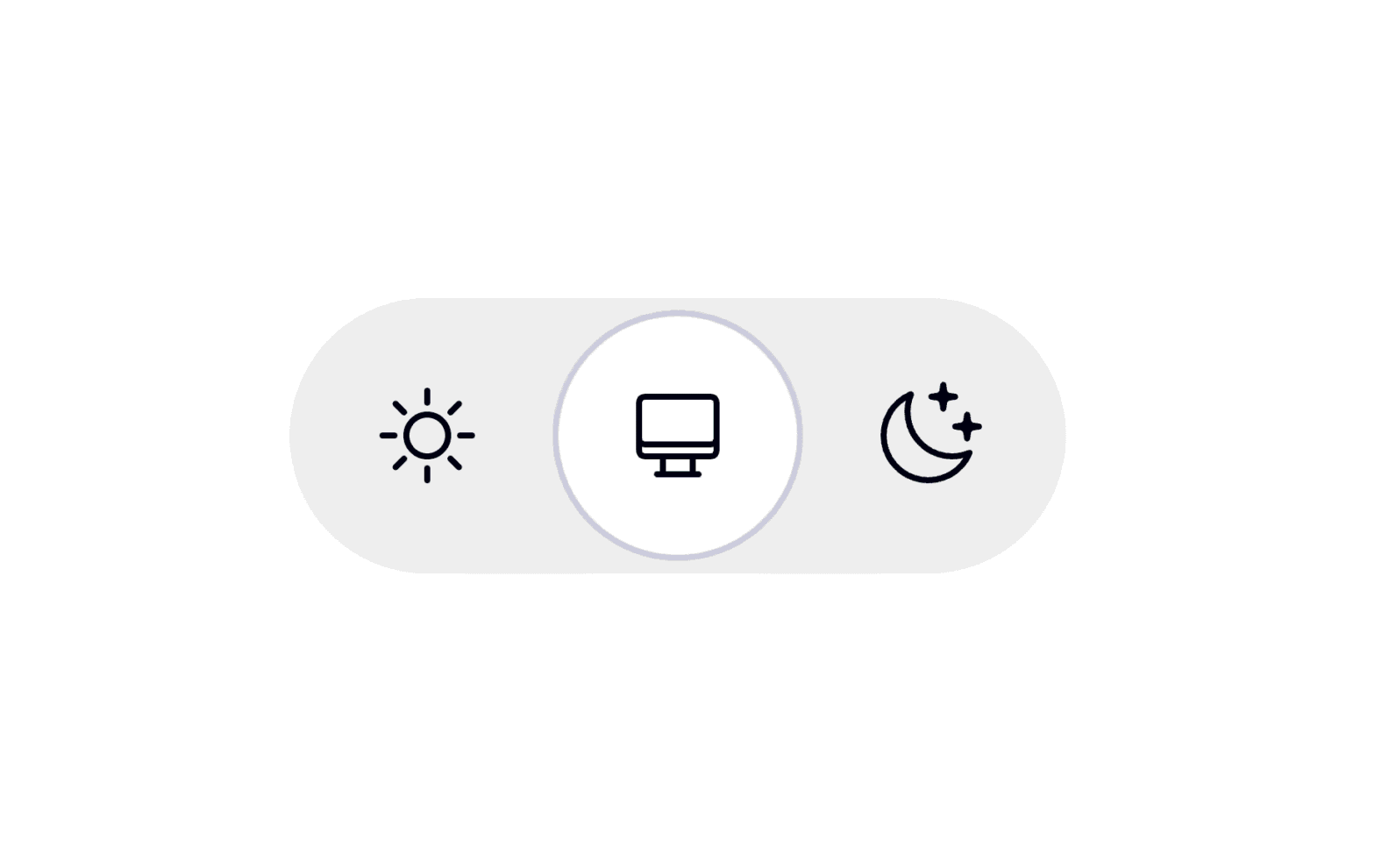
Adding a Dark Mode toggle to your website is a nice touch that many users appreciate. When implementing one, the default instinct for many developers is to reach for a simple binary switch: Light on one side, Dark on the other.
While a two-state control might seem like the most straightforward solution, I firmly believe it’s flawed from a user experience perspective. Instead, we should all be using tri-state controls. Let me explain why.
scroll-axis-lock: none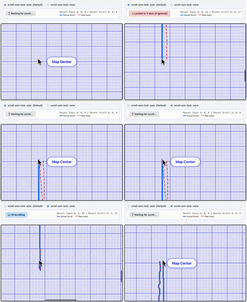
When you scroll a 2D scroller on a website, the browser does a lot of work behind the scenes to keep you on track. One of the things it typically does is scroll axis-locking (aka “railing”), ignoring some minor scroll deltas in the non-main scrolling axis. While helpful most of the times, this sometimes can get in the way such as in map or image zoom interfaces. With the new CSS scroll-axis-lock property you can disable the browser’s default scroll axis-locking behavior, allowing users to immediately perform a diagonal scroll.
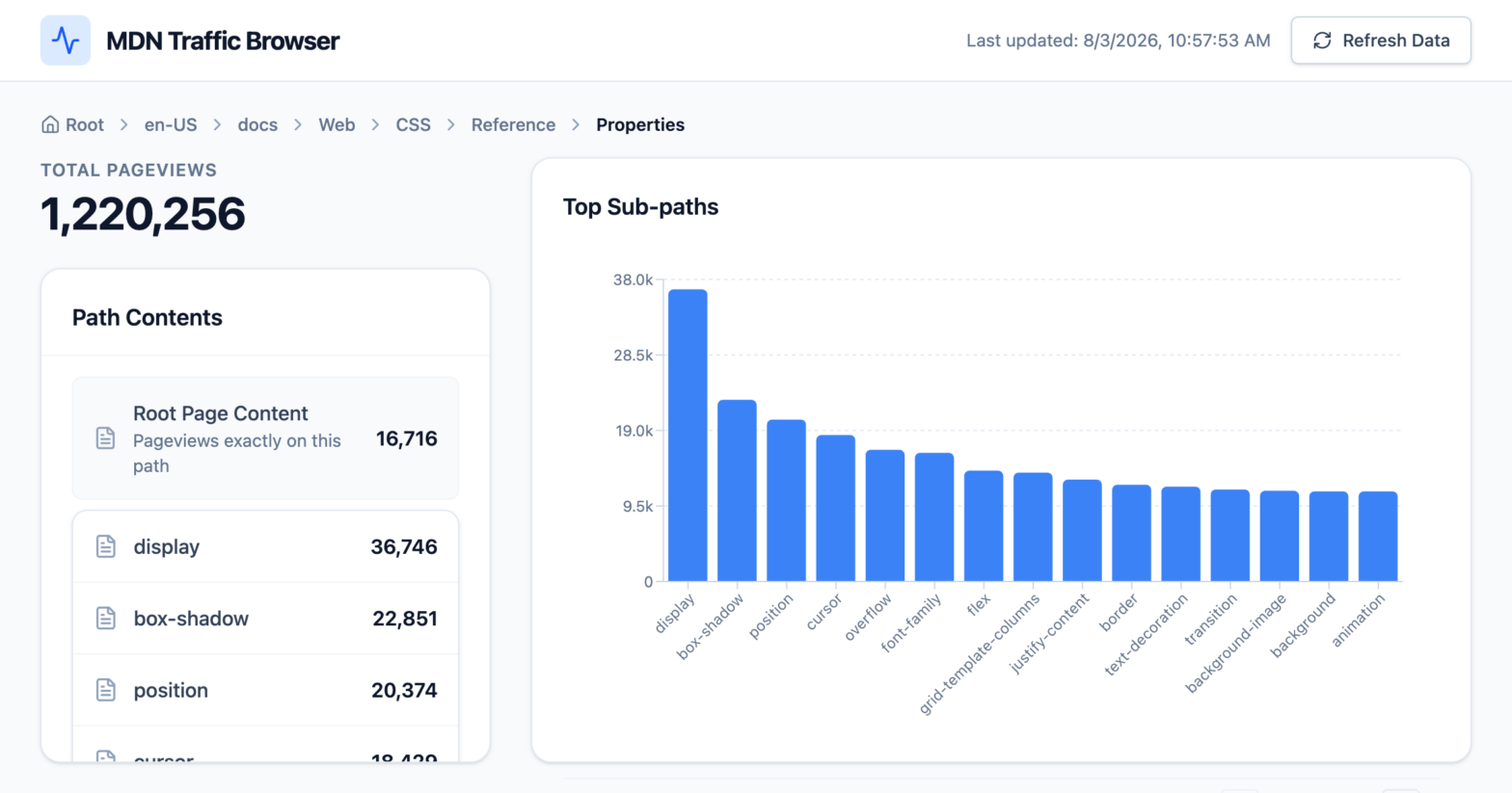
TIL: MDN exposes up-to-date page view data through https://popularities.mdn.mozilla.net/current.csv. Using Google AI Studio, I generated a visualizer to explore the data.
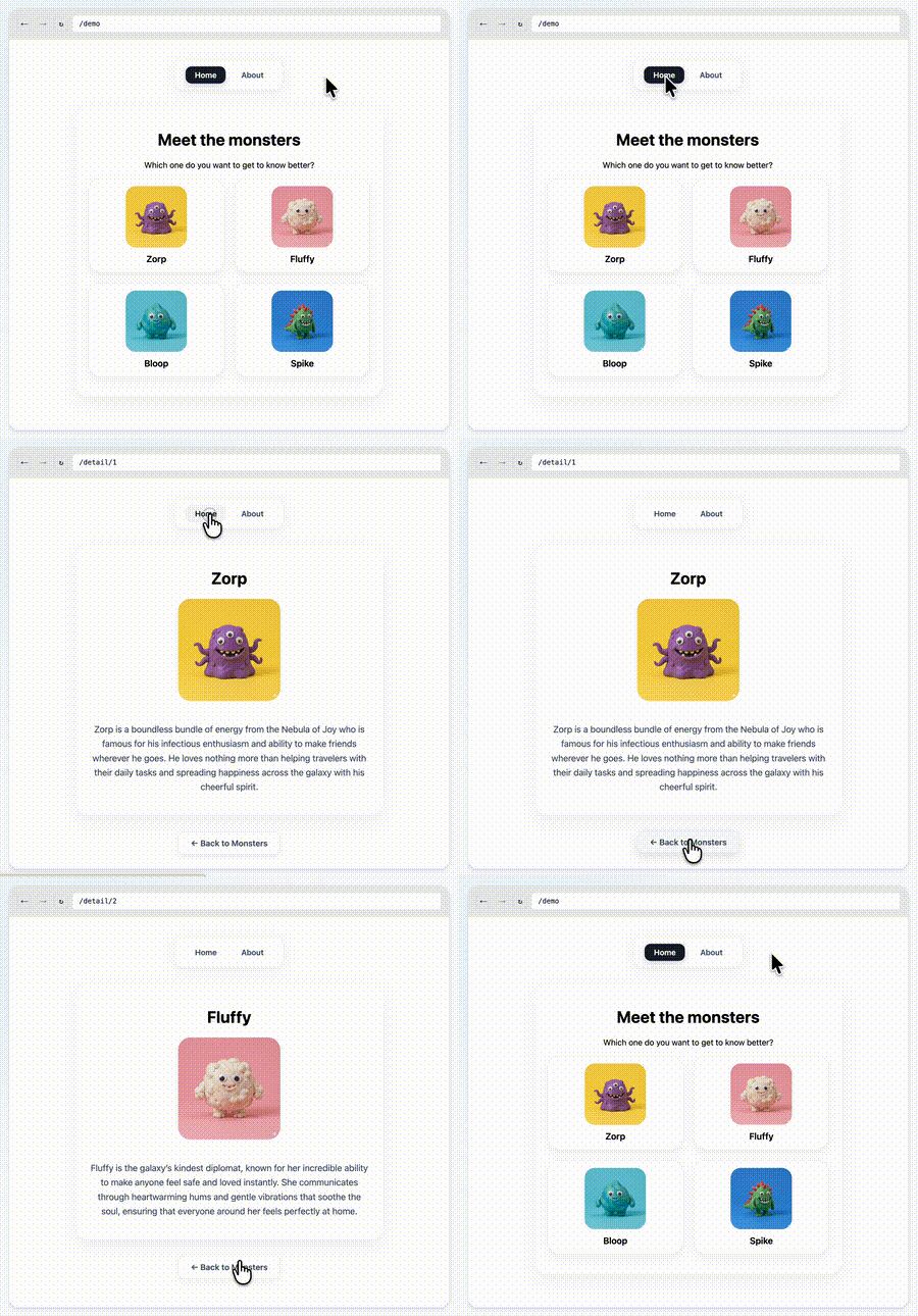
One of the things that we at Chrome have been thinking about for a while now is a way to do declarative route and navigation matching in CSS. Together with Noam Rosenthal and David Baron I’ve been working on it for the past few months.
After an initial introduction at the CSS Working Group back in January, and a quick feedback session at CSS Day in June, we think we have something that is ready for further discussion.
At next week’s CSS Working Group F2F (face-to-face) meeting in Berlin, we’ll be presenting our current line of thinking. This post is a quick intro to the concepts we’ll be covering.

Mid May, at this year’s Google I/O, Una and I gave a talk “What’s new in Web UI” live at Shoreline in the Chrome tent.