A trick you can use to make text better stand out against a background image, is to use a color overlay with a certain opacity on top of the image. This tool by Yaphi calculates the ideal opacity to use, so that the contrast meets the WCAG standards.
Tag Archives: wcag
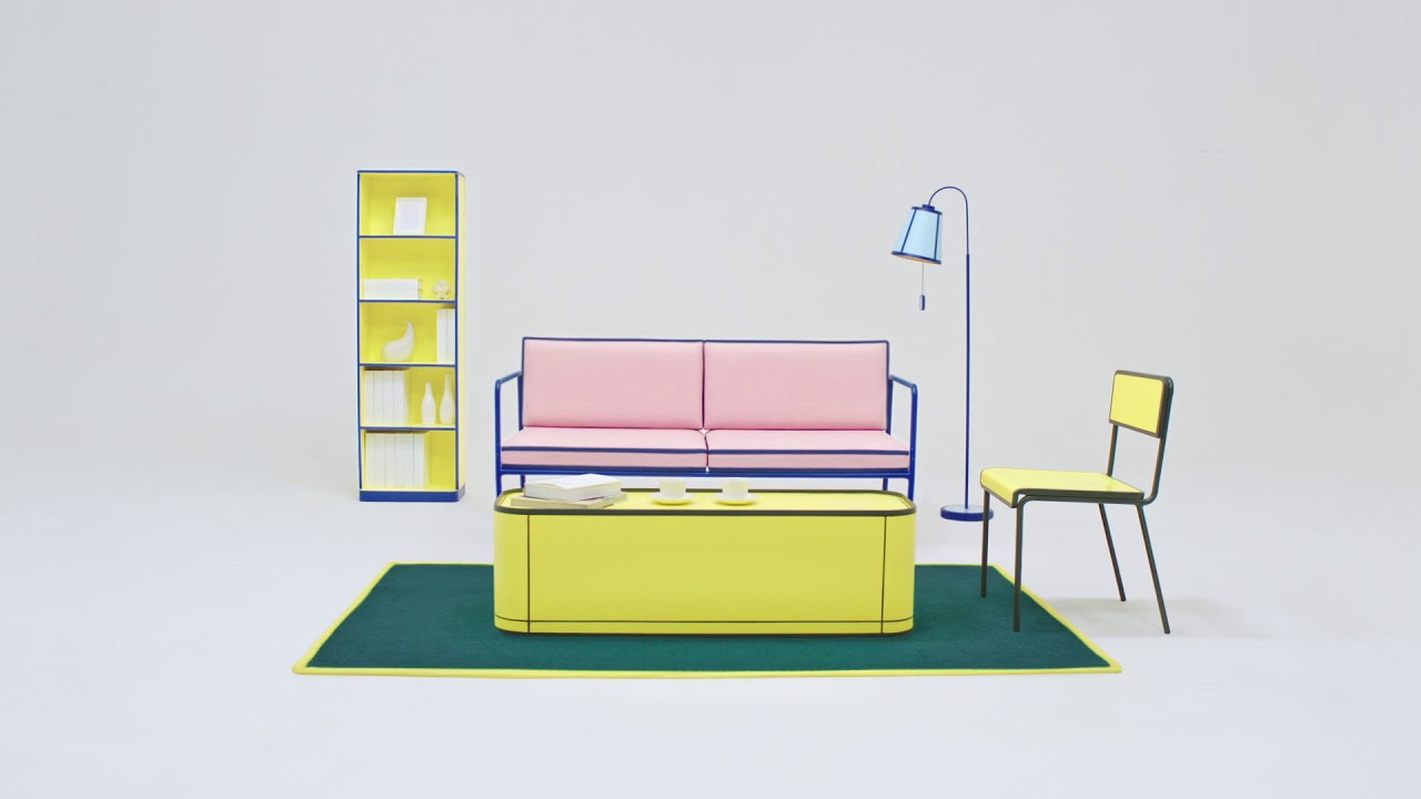
7:1 Furniture Collection, the first furniture made to be seen by the vision-impaired
The collection precisely uses a 7:1 color contrast ratio, a contrast level that makes a visual most accessible to people with disability. We use an international vision enhancement method by W3C organization, which makes a content or object visible at Level AAA standard (a highest level of visibility). Must say I find them visually quite …